


August 2026 Updated Aug 22, 2026
How to Optimize Images for a Website: The Complete Guide
Learn how to optimize images for your website using compression, resizing, modern formats like WebP and AVIF, responsive images, and practical SEO techniques to improve performance without sacrificing visual quality.

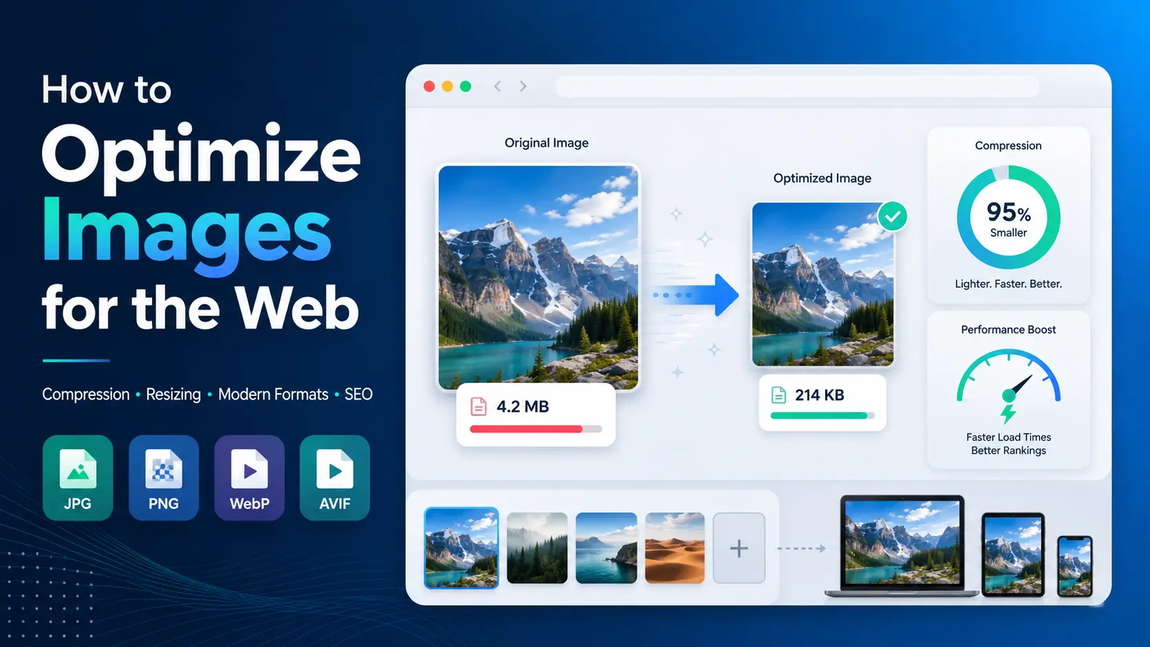
Images can make a website clearer, more attractive, and easier to use. But they can also become one of the biggest contributors to page weight when they are uploaded at unnecessarily large dimensions, saved in inefficient formats, or delivered without compression.
To optimize images for a website, you usually need to do four things: choose suitable dimensions, compress the file, select an efficient image format, and deliver the image correctly in your HTML or website platform.
You do not need to make every image tiny or sacrifice visible quality. Good website image optimization is about finding a sensible balance between file size, visual quality, dimensions, format, and how the image is actually used on the page.
This guide explains the complete process, from compression and resizing to WebP, AVIF, responsive images, SEO, lazy loading, and common mistakes.
What Is Website Image Optimization?
Website image optimization is the process of reducing the amount of image data a browser needs to download while preserving enough visual quality for the image's intended use.
That can involve:
Compressing the image
Reducing its pixel dimensions
Converting it to a more efficient format
Removing unnecessary metadata
Serving different image sizes to different devices
Loading images only when they are needed
Adding appropriate image SEO information
These techniques solve different problems, so it helps to understand the terminology.
Image dimensions
Image dimensions describe the width and height of an image in pixels.
For example:
2400 × 1600 pixels
A large image may have far more pixels than the website actually displays.
File size
File size describes how much storage or bandwidth the image requires.
For example:
850 KB
or:
2.4 MB
Pixel dimensions and file size are related, but they are not the same thing.
A 2000 × 1200 image could be 250 KB or several megabytes depending on its format, compression level, image content, and encoding.
Compression
Compression reduces the amount of data required to store an image.
There are two broad types.
Lossy compression removes some information from the image to achieve a smaller file size.
Lossless compression reduces file size without intentionally discarding the original image information.
Lossy compression can often produce significantly smaller files, particularly for photographs, although aggressive settings may create visible artifacts.
Resizing
Resizing changes the image's pixel dimensions.
For example:
4000 × 3000 → 1200 × 900
If your website only displays an image at roughly 1200 pixels wide, uploading a 4000-pixel version may result in unnecessary data being downloaded unless responsive image delivery is configured correctly.
Image conversion
Conversion changes an image from one format to another.
For example:
JPG → WebP
or:
PNG → AVIF
Conversion alone does not guarantee that the resulting file will be smaller or visually better. The best format depends on the type of image and how it will be used.
The Fastest Way to Optimize Images for a Website
For most website images, use this workflow:
Determine the largest dimensions the image actually needs.
Resize oversized images.
Choose an appropriate web image format.
Compress the image.
Compare the result with the original.
Upload the optimized version.
Use responsive image delivery where appropriate.
Add meaningful alt text when the image conveys useful content.
Check the page on both desktop and mobile.
Test performance after publishing.
The exact settings will vary. A large homepage hero, a small product thumbnail, a transparent logo, and a detailed photograph should not necessarily use the same optimization settings.
Why Image Optimization Matters
Image optimization affects more than storage space.
Faster page loading
Large images require more data to be transferred to the visitor's browser.
A page containing several multi-megabyte images can become unnecessarily heavy, especially for users on slower mobile networks.
Reducing those files can make pages noticeably faster.
Better mobile experience
Mobile visitors may have slower connections and smaller screens.
Sending a 3000-pixel-wide image to a phone when the image is displayed at only a few hundred CSS pixels wide may waste bandwidth.
Responsive image techniques can help browsers request a more suitable version.
Web performance
Images often account for a substantial portion of the resources downloaded on visually rich pages.
Image optimization can therefore contribute to better page-loading performance.
Google's performance metrics and Core Web Vitals can change over time, so check Google's current documentation before publishing specific thresholds or recommendations.
Reduced bandwidth
Smaller image files mean less data needs to be transferred.
This can reduce bandwidth consumption for both the website and its visitors.
The benefit becomes more significant as traffic grows or when pages contain many images.
SEO
Image optimization can support SEO indirectly by improving usability and performance. Image-specific practices such as descriptive filenames, appropriate alt text, relevant surrounding content, and accessible image delivery can also help search engines understand images.
Image SEO is not simply a matter of making files smaller.
Image Optimization in SEO ImgTask Image Optimizer
How to Compress Images for a Website
Image compression is one of the easiest places to start.
If an image is already the correct dimensions but the file is unnecessarily large, compression may reduce its size without requiring you to change the width or height.
Step 1: Choose the image
Identify the image you want to optimize.
Before compressing it, check whether its dimensions are significantly larger than necessary. If they are, resize it first.
Step 2: Compress the file
You can use ImgTask's image compression tool to reduce the file size directly.
Upload the image and process it using the available compression options.
Step 3: Check the visual result
Do not judge optimization only by the number of kilobytes saved.
Look at:
Faces
Text
Fine edges
Gradients
Shadows
Product details
Background textures
If compression causes obvious blockiness, smearing, banding, or loss of detail, use a less aggressive setting.
Step 4: Compare file sizes
Record both the original and optimized file size.
For example:
Version | Dimensions | Format | File Size |
Original | 1448 × 1086 | PNG | 2.11 MB |
Optimized | 1448 × 1086 | PNG | 634.1 KB |
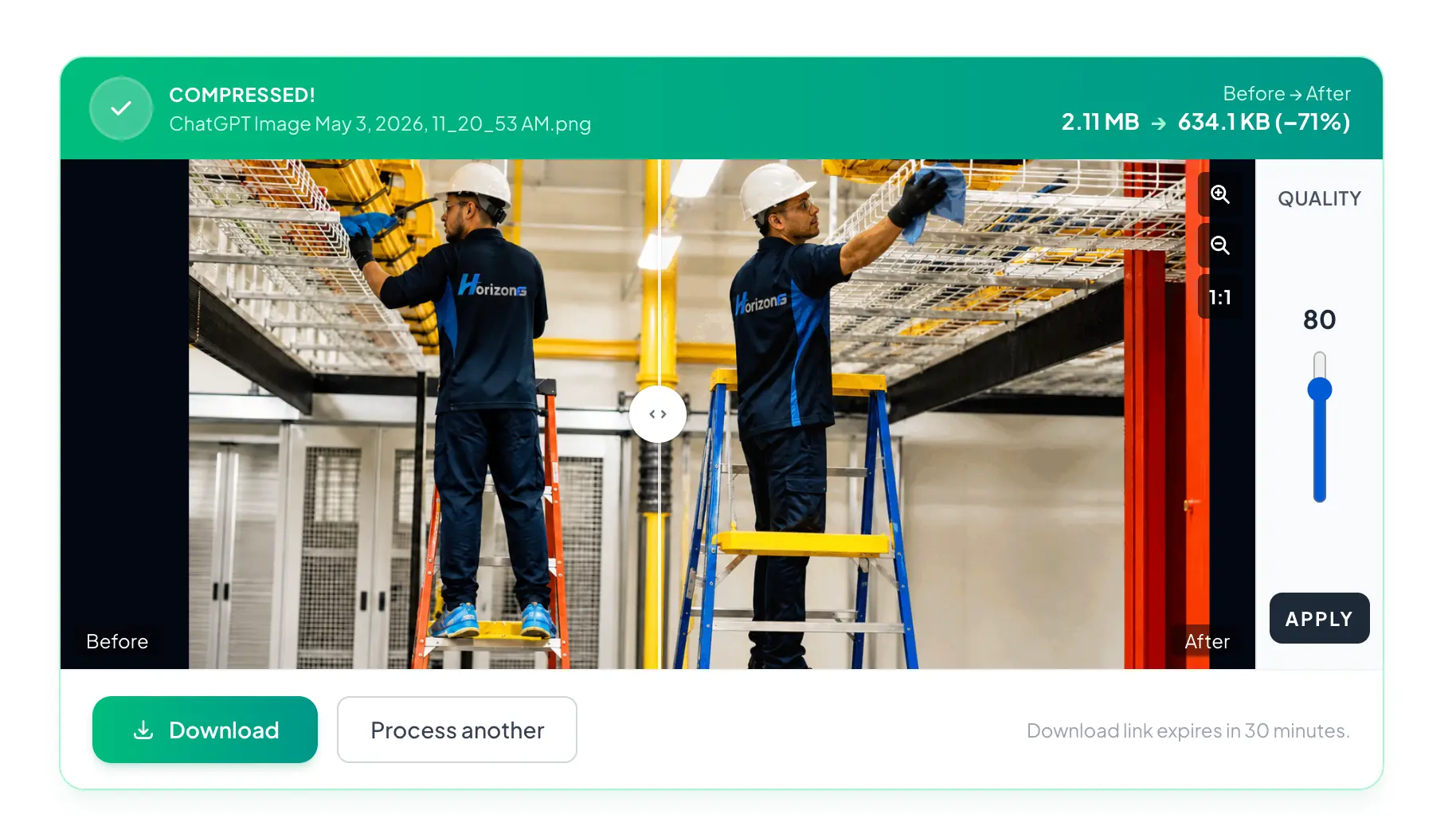
Adding real before-and-after measurements can make this guide much more useful than relying on generic compression advice.
Step 5: Test it in the page
An image that looks good when opened by itself may appear differently when displayed in a website layout.
Check the actual page on:
Desktop
Tablet if relevant
Mobile
Standard displays
High-density displays where possible
The goal is not to create the smallest possible image. The goal is to create an image that looks appropriate while transferring as little unnecessary data as practical.
Compression vs Resizing: What Is the Difference?
These two techniques are frequently confused.
Compression reduces how much data the image file requires.
Resizing changes the number of pixels in the image.
Imagine you have a photograph that is:
4000 × 2667 pixels and 5 MB
If your website displays it at a maximum width of 1200 pixels, resizing it to an appropriate size removes pixels your layout may never need.
After resizing, you can compress the resulting image further.
For many large camera or stock photographs, the practical workflow is therefore:
Resize → choose format → compress
not simply:
Compress the original 5 MB file
What Is the Best Image Format for Websites?
There is no single best image format for every website image.
The right format depends on what the image contains, whether transparency is needed, how much compatibility matters, and what size-versus-quality tradeoff you are willing to accept.
A practical comparison looks like this:
Format | Common Strength | Transparency | Typical Web Use |
JPEG/JPG | Photographs and broad compatibility | No standard alpha transparency | Photos, banners, article images |
PNG | Lossless graphics and transparency | Yes | Logos, interface graphics, screenshots |
WebP | Modern general-purpose web images | Yes | Photos, graphics, web assets |
AVIF | Efficient modern image delivery | Yes | Web images where workflow/support is suitable |
SVG | Vector graphics | Yes | Logos, icons, illustrations |
Browser, CMS, editing software, and platform support can change.
JPEG
JPEG remains useful for photographs and images with many colors and gradients.
It uses lossy compression and does not provide the same type of full alpha transparency available in formats such as PNG, WebP, and AVIF.
JPEG is still valuable when broad compatibility and a simple workflow are priorities.
PNG
PNG is commonly used when lossless storage or transparency is important.
It is particularly useful for:
Logos
Screenshots
Interface graphics
Illustrations with sharp edges
Images requiring transparency
However, a photographic PNG can become extremely large compared with formats designed to compress photographic content efficiently.
Do not use PNG automatically just because it preserves quality.
WebP
WebP is designed for web image delivery and supports both lossy and lossless compression as well as transparency.
It is a practical option for many photographs, graphics, thumbnails, and other web images.
If you currently have JPEG or PNG files, ImgTask provides format-specific conversion tools:
AVIF
AVIF is another modern image format designed to provide efficient compression.
Depending on the source image and encoding settings, AVIF can provide an attractive size-versus-quality tradeoff.
However, format choice should not be based on compression efficiency alone. Consider your browser requirements, image-processing workflow, CMS, fallback strategy, and software compatibility.
ImgTask can also be used when converting certain images to AVIF.
SVG
SVG is fundamentally different from raster formats such as JPEG, PNG, WebP, and AVIF.
SVG stores vector information rather than a fixed grid of pixels.
It can be excellent for:
Logos
Icons
Simple diagrams
Illustrations
Interface graphics
A properly designed SVG can remain sharp at many display sizes.
It is usually not a replacement for ordinary photographic images.
Which Format Should You Choose?
A simple starting point is:
Photographs: JPEG, WebP, or AVIF depending on your workflow.
Transparent graphics: PNG, WebP, AVIF, or SVG depending on the content.
Logos and simple icons: SVG when appropriate.
Screenshots: PNG or a well-tested modern format when the result remains visually clean.
Animations: choose a format based on the animation requirements and target-platform support.
Do not convert every image on your website to one format without checking the result.
The best web picture format is the one that meets the image's actual requirements with acceptable visual quality, file size, compatibility, and workflow complexity.
Resize Images Before Uploading Them
One of the most common image optimization mistakes is uploading images far larger than the layout requires.
Suppose a blog's content area never displays images above 1000 pixels wide.
Uploading a 5000-pixel-wide photograph may be unnecessary unless the site generates and serves appropriately sized responsive versions or the larger source is required for another purpose.
Before uploading, ask:
What is the image's maximum displayed width?
Does the site generate multiple sizes automatically?
Will the image appear on high-density displays?
Will visitors ever need the original resolution?
Does the CMS already resize uploads?
There is no universal pixel dimension that works for every website.
The correct size depends on your layout.
Do Not Confuse Display Size With Image Size
CSS can visually shrink a large image without reducing the amount of image data downloaded.
For example, this:
<img src="large-photo.jpg" width="600" alt="Example">does not automatically mean the source file itself contains only enough pixels for a 600-pixel display.
The browser may still download the original source.
This is why source dimensions, responsive images, and actual delivery behavior matter.
Use Responsive Images
A desktop monitor and a small mobile phone do not always need the same image file.
HTML provides mechanisms such as srcset and sizes that allow browsers to select from multiple image candidates.
A simplified example:
<img
  src="photo-1200.webp"
  srcset="
    photo-480.webp 480w,
    photo-800.webp 800w,
    photo-1200.webp 1200w
  "
  sizes="(max-width: 600px) 100vw, 1200px"
  alt="Description of the image"
>
The goal is to give the browser enough information to select an appropriate image based on the page layout and device conditions.
The exact implementation should match your CSS layout rather than copying arbitrary breakpoints.
Use the HTML Picture Element When Necessary
The <picture> element can be useful when you need different image sources depending on format or media conditions.
For example:
<picture>
  <source srcset="example.avif" type="image/avif">
  <source srcset="example.webp" type="image/webp">
  <img src="example.jpg" alt="Example image">
</picture>
This pattern can provide alternative formats with a fallback.
Whether you need this manually depends on your framework, CDN, CMS, and browser-support requirements.
Modern frameworks and image delivery services may automate parts of this process.
Understand Lazy Loading
Images lower on a page may not need to be downloaded immediately.
Native browser lazy loading can be enabled on appropriate images with:
<img
  src="article-image.webp"
  loading="lazy"
  alt="Description"
>
Lazy loading can reduce unnecessary initial downloads when a visitor has not yet scrolled to those images.
However, it should not automatically be applied to every image.
Images required immediately near the top of the page may need different loading behavior.
This is particularly important for prominent content that affects initial rendering and performance metrics.
Optimize Above-the-Fold Images Carefully
Hero banners and other prominent images require a different approach from images near the bottom of an article.
A large hero image may be one of the first major visual resources a browser needs.
Avoid unnecessarily delaying an important above-the-fold image.
Instead:
Keep its file size reasonable.
Use appropriate dimensions.
Use efficient encoding.
Provide responsive variants.
Avoid loading an unnecessarily huge desktop image on mobile.
Use the correct browser-loading strategy.
Specific resource-priority and Core Web Vitals recommendations should be verified against current browser and Google documentation.
Image Optimization in SEO
Image optimization for SEO includes more than compression.
Search engines need context to understand what an image represents and how it relates to the page.
Use useful filenames
Instead of:
IMG_74829.jpg
a descriptive filename could be:
web-image-compression-example.jpg
Do not stuff filenames with every keyword you are targeting.
Keep them short and descriptive.
Write appropriate alt text
The alt attribute provides text alternatives for images where appropriate and is important for accessibility.
Good alt text describes the meaningful content or purpose of the image in context.
For example:
<img
  src="compression-comparison.webp"
  alt="Original and compressed website image shown side by side"
>
Do not force keywords into alt text when they do not accurately describe the image.
Decorative images may need different treatment.
For accessibility-sensitive implementation guidance, consult current authoritative accessibility documentation.
Add image context
A relevant caption, nearby paragraph, heading, and surrounding page topic can all provide context.
An image placed randomly on a page with an optimized filename is not automatically well optimized for search.
Make image pages crawlable where appropriate
Avoid accidentally blocking important images from search crawlers if you want them discoverable.
Technical SEO configurations vary by site, CMS, CDN, and robots setup.
Remove Unnecessary Metadata When Appropriate
Image files may contain metadata such as camera information, timestamps, editing details, or location information.
Some optimization workflows remove unnecessary metadata to reduce file size.
The savings vary from image to image.
Be careful if your workflow depends on metadata or if you intentionally need copyright, orientation, color, or other embedded information.
Do not remove metadata blindly.
Keep the Correct Color and Orientation
Optimization should not change how an image is supposed to look.
After conversion or compression, check:
Orientation
Color appearance
Transparency
Gradients
Embedded text
Fine details
Color-management behavior can vary across workflows and software.
If exact color reproduction is important, test your optimized images in the browsers and devices that matter to your audience.
Optimize Transparent Images Carefully
Transparent images require special attention.
A PNG logo might rely on transparent pixels around the design. Converting it to a format or configuration that does not preserve transparency can create an unwanted solid background.
When converting transparent images:
Confirm that the target format supports the required transparency.
Preview the result against light and dark backgrounds.
Inspect semi-transparent edges.
Confirm that shadows and antialiasing remain clean.
This is particularly important for logos and interface graphics.
Do Not Overcompress Text and UI Screenshots
Screenshots often contain sharp text, buttons, borders, and small interface details.
Aggressive lossy compression may make these elements harder to read.
For screenshots, prioritize legibility.
A slightly larger file that preserves readable interface text may be preferable to a smaller file with obvious artifacts.
Always optimize based on the image's purpose rather than applying the same compression setting to every file.
Create a File-Size Budget
Instead of asking, "What should every website image be under?" create a practical budget based on the page.
Consider:
Number of images
Importance of each image
Typical connection speed
Mobile traffic
Page type
Image dimensions
Visual-quality requirements
A product-detail page containing six photographs has different requirements from a text-heavy documentation page with a single diagram.
There is no universal file-size limit that guarantees good performance.
Use page-level performance testing to guide decisions.
Check Images Already on Your Website
Image optimization should not apply only to future uploads.
Existing sites often contain old images that were uploaded without a consistent optimization process.
Audit:
Homepage hero images
Blog featured images
Product photographs
Thumbnails
Background images
Logos
Icons
Portfolio images
Team photographs
Decorative assets
Look for unusually large files and dimensions.
A single oversized hero image may deserve more attention than dozens of already-small icons.
Create a Repeatable Website Image Optimization Workflow
A consistent process prevents oversized files from returning later.
A useful workflow can be:
1. Start with the source image
Keep a high-quality original somewhere appropriate if it may be required later.
Do not repeatedly edit and recompress already heavily compressed files when the original is available.
2. Determine the intended use
Ask where the image will appear.
For example:
Hero banner
Blog image
Thumbnail
Product gallery
Logo
Screenshot
3. Resize
Reduce excessive dimensions while retaining enough pixels for the intended display.
4. Select the format
Choose JPEG, PNG, WebP, AVIF, SVG, or another appropriate format based on the image.
5. Compress
Reduce unnecessary file size while checking visual quality.
6. Create responsive variants
For important responsive layouts, generate the sizes required by your implementation.
7. Upload and implement correctly
Use suitable HTML attributes, loading behavior, and descriptive text.
8. Test the actual page
Measure the real page instead of assuming optimization worked.
Website Image Optimization Example
Consider a hypothetical homepage hero image.
The original file is:
4288 × 2848 pixels
JPEG
8.8 MB
The site's layout never displays the hero above approximately 1280 x 720.
A test could compare:
Version | Dimensions | Format | Compression Setting | File Size |
Original | 4288 × 2848 | JPEG | Original | 8.8 MB |
Resized | 1280 × 850 | JPEG | 80% | 738.3 KB |
WebP | 1280 × 850 | WebP | 80% | 45.6 KB |
AVIF | 1280 × 850 | AVIF | 80% | 25.6 KB |

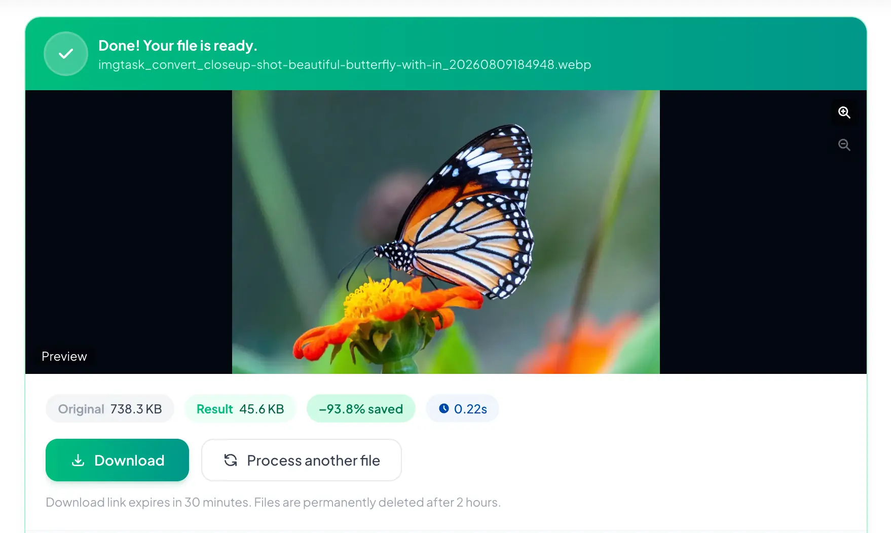
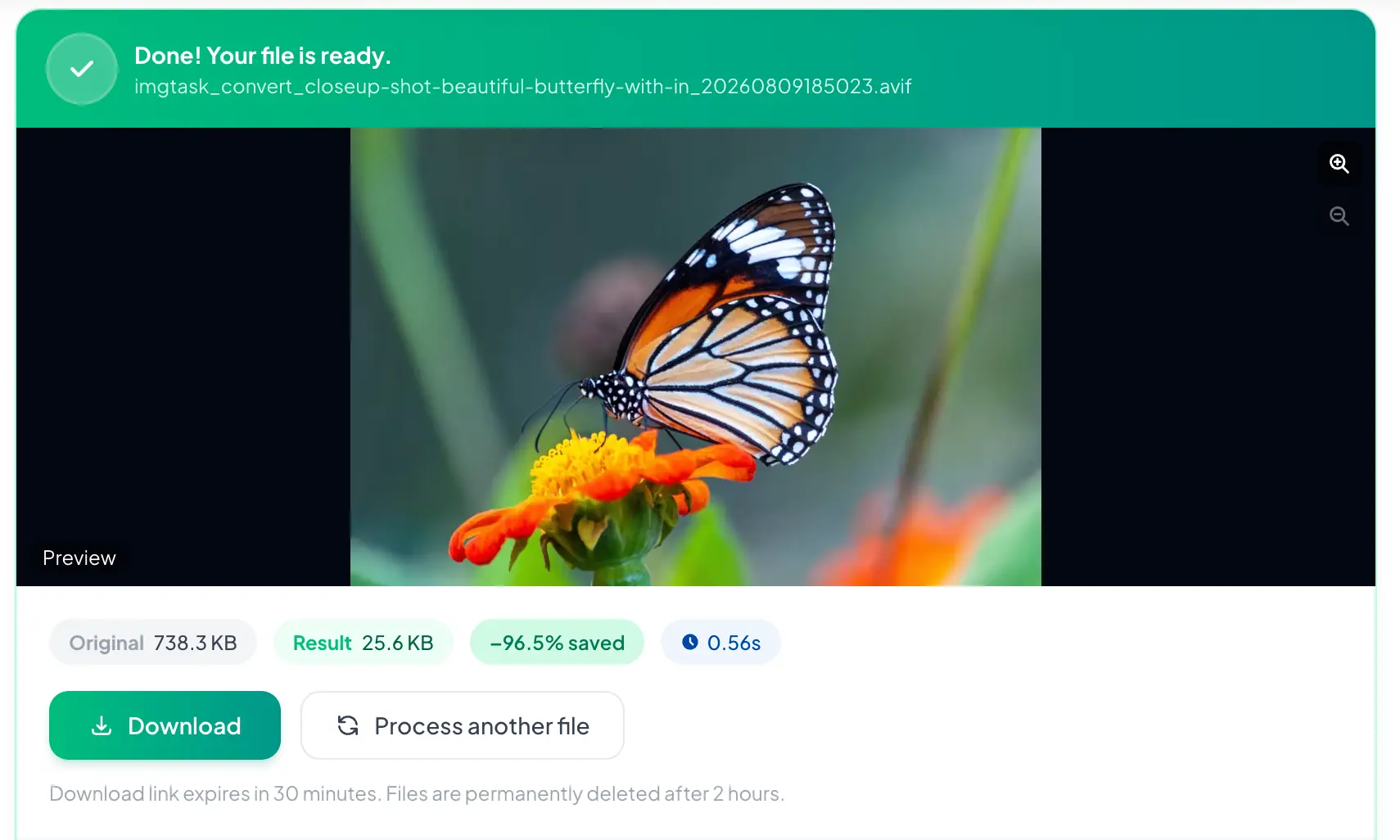
For the strongest version of this guide, perform this test with several real image types:
Photograph
Screenshot
Transparent graphic
Product image
Hero banner
Include side-by-side crops so readers can evaluate the quality differences themselves.
Useful Image Optimization Tools
A good image optimization workflow may involve several different types of tools.
Image compressor
Use this when the dimensions are already appropriate but the file contains more data than necessary.
ImgTask:
Image resizer
Use this when the source has unnecessarily large pixel dimensions.
ImgTask:
Format converter
Use a converter when another image format better suits the intended delivery method.
ImgTask examples:
You do not necessarily need to perform every operation on every image.
If a PNG logo is already 12 KB, for example, spending significant effort trying to save another tiny amount of data may provide little practical benefit compared with fixing a multi-megabyte hero photograph.
Common Website Image Optimization Mistakes
Uploading camera-size images directly
Modern cameras and phones can produce images far larger than most website layouts need.
Check dimensions before uploading.
Compressing without resizing
Compression alone may leave a huge number of unnecessary pixels.
Resize when appropriate.
Resizing without compressing
Correct dimensions do not automatically mean an efficient file.
Check compression too.
Converting everything to one format
WebP or AVIF may be useful, but that does not mean every asset should automatically use the same format.
Choose based on content and requirements.
Using PNG for every image
PNG is useful, especially for lossless graphics and transparency.
It can be inefficient for large photographs.
Compressing until quality is visibly damaged
Smaller is not always better.
A product image that hides details or a screenshot with unreadable text has failed its purpose.
Ignoring mobile users
Desktop-only testing can hide inefficient image delivery.
Check smaller screens and slower connection conditions.
Lazy-loading every image
Important above-the-fold images may require different loading behavior.
Use lazy loading selectively.
Forgetting image SEO and accessibility
Compression is only part of optimization.
Use meaningful alt text where appropriate and keep images contextually relevant.
Trusting file extensions alone
An image ending in .webp is not automatically optimized.
Encoding settings, dimensions, image content, and implementation still matter.
How to Tell If an Image Is Properly Optimized
Ask these questions:
Are the dimensions appropriate for how the image is displayed?
Is the image format suitable for the content?
Is the file compressed reasonably?
Does the image still look good?
Is transparency preserved if needed?
Is readable text still sharp?
Is the browser receiving an appropriately sized source?
Is unnecessary off-screen content being deferred?
Does the image have meaningful alt text where appropriate?
Does the page perform well after the image is added?
If the answer is yes across those areas, you are probably much closer to a well-optimized image than someone simply targeting an arbitrary KB value.
How Often Should You Review Website Images?
Review image optimization whenever you:
Redesign the site
Add a new image-heavy page
Change CMS or frameworks
Replace a hero banner
Add a product catalogue
Migrate hosting or CDN infrastructure
Notice performance problems
Change your image-delivery workflow
It can also be useful to periodically identify your largest image resources and fix the worst offenders first.
Practical Image Optimization Checklist
Before publishing an image, check:
Dimensions match the intended use.
File is not unnecessarily large.
Suitable format selected.
Compression checked visually.
Transparency still works if required.
Mobile delivery considered.
Responsive sources configured if useful.
Important images have appropriate loading behavior.
Meaningful images have useful alt text.
Filename is understandable.
Page has been tested after upload.
This checklist is more reliable than treating compression as the entire optimization process.
Frequently Asked Questions
What is the best way to optimize images for a website?
Start by resizing images to appropriate dimensions, choose a suitable format, and then compress them while checking visual quality. For responsive websites, also make sure browsers can receive appropriately sized versions for different devices.
How much should I compress images for a website?
There is no universal compression percentage that works for every image. Compress until the file becomes reasonably small while the image still looks suitable for its purpose. Detailed photographs, screenshots, logos, and thumbnails may all need different settings.
Is WebP better than JPEG for websites?
WebP can be a strong option for many website images, but format choice depends on image content, quality requirements, compatibility, and workflow. JPEG can still be appropriate in many situations.
Should I use WebP or AVIF?
Both can be useful modern web formats. Compare actual output using your images rather than choosing purely from theoretical compression advantages. Consider browser support, CMS support, workflow complexity, and visual quality.
Does image optimization improve SEO?
It can support SEO through better page performance and user experience, while image-specific practices such as descriptive alt text, meaningful filenames, and relevant surrounding content help search engines understand images. Compression alone does not guarantee better rankings.
Should I resize an image before compressing it?
If the image dimensions are much larger than your website requires, resizing first is usually sensible. You can then compress the resized version.
Can I compress images without losing quality?
Lossless compression is designed to reduce file size without intentionally discarding image information. Lossy compression can achieve greater reductions by removing information, although sensible settings may produce changes that are difficult to notice during normal viewing.
Conclusion
To optimize images for a website effectively, do not focus on compression alone. Resize oversized images, select an appropriate format, compress them carefully, deliver responsive versions where useful, and test the finished page.
If you already have images that are the right dimensions but their files are too large, start with ImgTask's image compression tool.
For a stronger long-term workflow, combine compression with resizing, modern formats, responsive delivery, accessibility, and real performance testing.
The team
Written by
Dinitha Ransidu
authorKeep reading
Related articles

How to Create a QR Code: A Complete Guide for URLs, WiFi and More
Dinitha Ransidu
August 27, 2026 17 min read
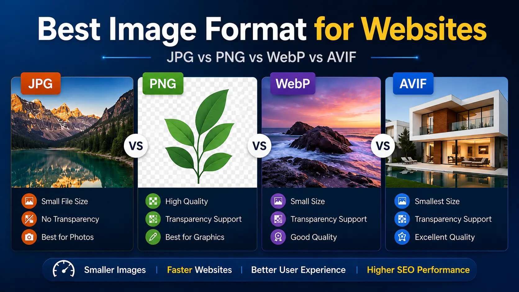
Best Image Format for Websites: JPG vs PNG vs WebP vs AVIF
Dinitha Ransidu
August 3, 2026 11 min read
How to Reduce Image File Size Without Losing Quality
Dinitha Ransidu
August 2, 2026 13 min read